
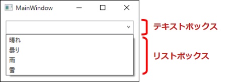
WPFだけに限らず、アプリケーションを開発する際によく利用するのがComboBox(コンボボックス)コントロールです。
コンボボックスの右端の矢印マークをクリックすると、選択できる項目がドロップダウンリストで表示されます。
今回はユーザーにより直観的に操作してもらうために、ドロップダウンの項目の先頭にアイコンを表示するサンプルを紹介します。
このサンプルは「Material Design」を使っています。下準備として、このデザインをプロジェクトに適用させる必要があります。次の記事を参考にして準備を行ってください。

アイコン付きのComboBoxを表示する
まずは、コンボボックスにアイコンを表示した画面をみてみましょう。
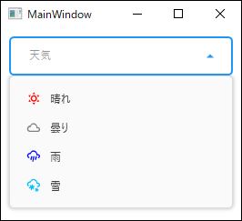
このようにアイコンを左側に表示することができます。右側には項目名が表示されます。
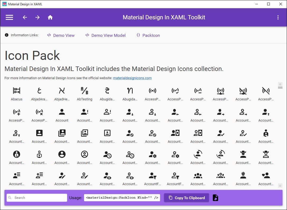
アイコンを表示する「Material Design In Toolkit」には様々なアイコンが用意されています。
アイコンの種類はMaterial Designのデモアプリを起動することで確認することができます。
デモアプリのダウンロード方法は次の記事を参考にしてください。

使い方は非常にシンプルで、materialDesign:PackIconのKindプロパティで表示したいアイコンの種類を指定するだけで表示することが可能です。
アイコンの使い方が分かったところで、コンボボックスの項目にアイコンを表示してみましょう。表示する手段としてXAMLに直接記述する方法、もしくはViewModelからバインドする方法の2種類があります。
XAMLに直接記述する方法
まずはXAMLに直接アイコンを追加する方法を紹介します。
XAMLにComboBoxのコントロールを配置します。大きさ(WeightやHight)、位置(Margin)など対象のプロパティを設定します。
ComboBoxItemにStackPanelを配置して、子要素としてアイコン(materialDesign:PackIcon)と項目名(TextBlock)を追加します。
これを表示する項目の数だけ量産すれば完成です。もちろん項目毎にアイコンの種類と項目名は変更が必要です。
ComboBoxに項目を追加する方法をおさらいしたい方やComboBoxの使い方や実装方法について詳しく知りたい方はこちらをどうぞ。

実際に記述したXAMLの例が次の通りです。
<Window
    x:Class="ComboBoxSample.MainWindow"
    xmlns="http://schemas.microsoft.com/winfx/2006/xaml/presentation"
    xmlns:x="http://schemas.microsoft.com/winfx/2006/xaml"
    xmlns:d="http://schemas.microsoft.com/expression/blend/2008"
    xmlns:materialDesign="http://materialdesigninxaml.net/winfx/xaml/themes"
    xmlns:mc="http://schemas.openxmlformats.org/markup-compatibility/2006"
    Title="MainWindow"
    Width="280"
    Height="250"
    mc:Ignorable="d">
    <Grid>
        <ComboBox
            Name="cmbSample"
            Margin="10,10,10,160"
            Padding="20,10,20,10"
            materialDesign:HintAssist.Hint="天気"
            Style="{StaticResource MaterialDesignOutlinedComboBox}">
            <ComboBoxItem>
                <StackPanel Orientation="Horizontal">
                    <materialDesign:PackIcon
                        Margin="2,0,10,0"
                        Foreground="Red"
                        Kind="WeatherSunny" />
                    <TextBlock Text="晴れ" />
                </StackPanel>
            </ComboBoxItem>
            <ComboBoxItem>
                <StackPanel Orientation="Horizontal">
                    <materialDesign:PackIcon
                        Margin="2,0,10,0"
                        Foreground="Gray"
                        Kind="WeatherCloudy" />
                    <TextBlock Text="曇り" />
                </StackPanel>
            </ComboBoxItem>
            <ComboBoxItem>
                <StackPanel Orientation="Horizontal">
                    <materialDesign:PackIcon
                        Margin="2,0,10,0"
                        Foreground="Blue"
                        Kind="WeatherPouring" />
                    <TextBlock Text="雨" />
                </StackPanel>
            </ComboBoxItem>
            <ComboBoxItem>
                <StackPanel Orientation="Horizontal">
                    <materialDesign:PackIcon
                        Margin="2,0,10,0"
                        Foreground="DeepSkyBlue"
                        Kind="WeatherSnowyHeavy" />
                    <TextBlock Text="雪" />
                </StackPanel>
            </ComboBoxItem>
        </ComboBox>
    </Grid>
</Window>
using System.Windows;

namespace ComboBoxSample
{
    public partial class MainWindow : Window
    {
        public MainWindow()
        {
            InitializeComponent();
        }
    }
}
コードビハインドへの記述はしていません。デザイン部分のXAMLファイルのみコードを記述しました。
このソースコードで動かしてみましょう。
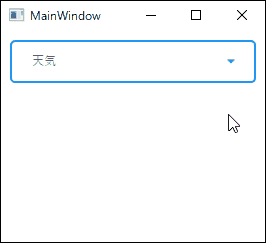
図では分かりにくいですが、アイコンの色を変更することも可能です。materialDesign:PackIconのForegroundプロパティに色を設定すれば、設定した色で表示されます。
アイコンがあることでシンプル過ぎず、見た目がいい感じになりますね。
ViewModelからバインドする方法
Viewにバインドするプロパティは、項目によって変化するmaterialDesign:PackIconのKindプロパティ、ForegroundプロパティとTextBlockのTextプロパティ、合計3箇所とします。
ViewModelでコレクションを作成し、それぞれのプロパティ値をViewのコントロールに通知するようなイメージです。
XAMLファイル、コードビハインド、ViewModelは次の通りです。
<Window
    x:Class="ComboBoxSample.MainWindow"
    xmlns="http://schemas.microsoft.com/winfx/2006/xaml/presentation"
    xmlns:x="http://schemas.microsoft.com/winfx/2006/xaml"
    xmlns:d="http://schemas.microsoft.com/expression/blend/2008"
    xmlns:materialDesign="http://materialdesigninxaml.net/winfx/xaml/themes"
    xmlns:mc="http://schemas.openxmlformats.org/markup-compatibility/2006"
    Title="MainWindow"
    Width="280"
    Height="250"
    mc:Ignorable="d">
    <Grid>
        <ComboBox
            Name="cmbSample"
            Margin="10,10,10,160"
            Padding="20,10,20,10"
            materialDesign:HintAssist.Hint="天気"
            Style="{StaticResource MaterialDesignOutlinedComboBox}">
            <ComboBoxItem>
                <StackPanel Orientation="Horizontal">
                    <materialDesign:PackIcon
                        Margin="2,0,10,0"
                        Foreground="{Binding Weathers[0].Color}"
                        Kind="{Binding Weathers[0].Icon}" />
                    <TextBlock Text="{Binding Weathers[0].Name}" />
                </StackPanel>
            </ComboBoxItem>
            <ComboBoxItem>
                <StackPanel Orientation="Horizontal">
                    <materialDesign:PackIcon
                        Margin="2,0,10,0"
                        Foreground="{Binding Weathers[1].Color}"
                        Kind="{Binding Weathers[1].Icon}" />
                    <TextBlock Text="{Binding Weathers[1].Name}" />
                </StackPanel>
            </ComboBoxItem>
            <ComboBoxItem>
                <StackPanel Orientation="Horizontal">
                    <materialDesign:PackIcon
                        Margin="2,0,10,0"
                        Foreground="{Binding Weathers[2].Color}"
                        Kind="{Binding Weathers[2].Icon}" />
                    <TextBlock Text="{Binding Weathers[2].Name}" />
                </StackPanel>
            </ComboBoxItem>
            <ComboBoxItem>
                <StackPanel Orientation="Horizontal">
                    <materialDesign:PackIcon
                        Margin="2,0,10,0"
                        Foreground="{Binding Weathers[3].Color}"
                        Kind="{Binding Weathers[3].Icon}" />
                    <TextBlock Text="{Binding Weathers[3].Name}" />
                </StackPanel>
            </ComboBoxItem>
        </ComboBox>
    </Grid>
</Window>
using System.Windows;
namespace ComboBoxSample
{
public partial class MainWindow : Window
{
public MainWindow()
{
InitializeComponent();
DataContext = new ViewModel();
}
}
}ViewModelクラス
using System.Collections.ObjectModel;

namespace ComboBoxSample
{
    class ViewModel
    {
        public ObservableCollection Weathers { get; private set; }

        public ViewModel()
        {
            Weathers = new ObservableCollection
            {
                new Weather( 1 , "晴れ", "WeatherSunny", "Red"),
                new Weather( 2, "曇り", "WeatherCloudy", "Gray"),
                new Weather( 3, "雨", "WeatherPouring", "Blue"),
                new Weather( 4, "雪", "WeatherSnowyHeavy", "DeepSkyBlue")
            };
        }
    }

    public class Weather
    {
        public Weather(int id, string name, string icon, string color)
        {
            Id = id;
            Name = name;
            Icon = icon;
            Color = color;
        }

        public int Id { get; set; }
        public string Name { get; set; }
        public string Icon { get; set; }
        public string Color { get; set; }
    }
}
上記のソースコードを実行すると、先ほどと全く同じ結果が表示されます。
これでアイコン付きのコンボボックスを作成することができました。
まとめ
今回はComboBoxにアイコンと項目名のペアで表示する方法について紹介しました。
このサンプルでは「Material Design」を適用させています。このデザインを採用していないプロジェクトでは、そのままサンプルコードを使うことができませんが、参考にはなると思います。
ComboBoxをカスタマイズしたい方は是非アイコン付きのアイテムを作成してみてはいかがでしょうか。
以上、最後まで読んでいただきありがとうございました。