
この記事では MahApps.Metro.IconPacks を使ってアイコンを表示する方法について紹介しています。
ぜひ最後まで読んでみてください。
MahApps.Metro.IconPacks とは?
MahApps.Metro.IconPacksとは、MahApps.Metro の作成者である Jan Karger さんが作成された WPF に対応したアイコンパッケージです。
このライブラリは .NET Framework 4.6.2 以降のフレームワーク及び .NET Core 3.0 / .NET Core 3.1 / .NET 5 をサポートしています。
無料で利用できるにも関わらずアイコンの種類も豊富で、ボタンやコンボボックスといったコントロール上に表示することができます。
 ※上記はMahApps.Metro.Iconsのデモアプリです。
このアイコンパッケージは MahApps.Metro をインストールすることなく、単体でも利用することができます。
NuGetからインストールする
それではプロジェクトにライブラリを追加してみましょう。
今回は以下の環境でインストールと使い方を紹介していきます。
- 開発環境:Visual Studio 2022
- フレームワーク:.NET 6.0
- OS:Windows 10
- プロジェクト:WPF
- プロジェクト名:SAMPLE
ソリューションエクスプローラーを開いて、プロジェクト名を選択して右クリックします。
コンテキストメニューから「NuGetパッケージ管理」をクリックして開きます。
検索欄に「MahApps.Metro.IconPacks」と入力します。
「MahApps.Metro.IconPacks」を選択して、「インストール」ボタンをクリックします。
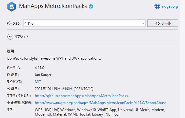
これでライブラリのインストールが完了しました。
今回インストールしたライブラリのバージョンは「4.11.0」です。
アイコンパックの使い方
ここからはアイコンの使い方を具体的に説明していきます。
基本的な使い方
MahApps.Metro.IconPacks をプロジェクトで使うには、対象の XAML ファイルのヘッダー部分に名前空間を定義します。
xmlns:iconPacks=”http://metro.mahapps.com/winfx/xaml/iconpacks”
<UserControl
    x:Class="SAMPLE.Sample"
    xmlns="http://schemas.microsoft.com/winfx/2006/xaml/presentation"
    xmlns:x="http://schemas.microsoft.com/winfx/2006/xaml"
    xmlns:d="http://schemas.microsoft.com/expression/blend/2008"
    xmlns:iconPacks="http://metro.mahapps.com/winfx/xaml/iconpacks"
    xmlns:mc="http://schemas.openxmlformats.org/markup-compatibility/2006"
    d:DesignHeight="450"
    d:DesignWidth="800"
    mc:Ignorable="d">
    <Grid />
</UserControl>
まずはシンプルにアイコンだけ画面に表示します。
アイコンの追加方法ですが、PackIconModern クラスを使います。Kind プロパティでアイコンの種類を指定することができ、PackIconModernKind 列挙体の中から選択します。
<iconPacks:PackIconModern …/>
<UserControl
    x:Class="SAMPLE.Sample"
    xmlns="http://schemas.microsoft.com/winfx/2006/xaml/presentation"
    xmlns:x="http://schemas.microsoft.com/winfx/2006/xaml"
    xmlns:d="http://schemas.microsoft.com/expression/blend/2008"
    xmlns:iconPacks="http://metro.mahapps.com/winfx/xaml/iconpacks"
    xmlns:local="clr-namespace:SAMPLE"
    xmlns:mc="http://schemas.openxmlformats.org/markup-compatibility/2006"
    d:DesignHeight="450"
    d:DesignWidth="800"
    mc:Ignorable="d">
    <Grid>
        <StackPanel HorizontalAlignment="Center" VerticalAlignment="Center">
            <iconPacks:PackIconModern
                Width="60"
                Height="60"
                Foreground="Black"
                Kind="Battery0" />
            <iconPacks:PackIconModern
                Width="60"
                Height="60"
                Foreground="Red"
                Kind="Battery1" />
            <iconPacks:PackIconModern
                Width="60"
                Height="60"
                Foreground="Orange"
                Kind="Battery2" />
            <iconPacks:PackIconModern
                Width="60"
                Height="60"
                Foreground="Green"
                Kind="Battery3" />
        </StackPanel>
    </Grid>
</UserControl>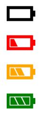
上記の例ではモダンUIのカテゴリとして定義されているものを紹介しましたが、他にもカテゴリ毎に様々なアイコンが用意されています。
Material Design や Font Awesome Free などが利用できます。当然、カテゴリによってアイコンのデザインも異なりますので、全体のデザインに合ったアイコンを選ぶようにしましょう。
<iconPacks:PackIconMaterialDesign …/>
<iconPacks:PackIconFontAwesome …/>
<iconPacks:PackIconUnicons …/>
<UserControl
    x:Class="SAMPLE.Sample"
    xmlns="http://schemas.microsoft.com/winfx/2006/xaml/presentation"
    xmlns:x="http://schemas.microsoft.com/winfx/2006/xaml"
    xmlns:d="http://schemas.microsoft.com/expression/blend/2008"
    xmlns:iconPacks="http://metro.mahapps.com/winfx/xaml/iconpacks"
    xmlns:local="clr-namespace:SAMPLE"
    xmlns:mc="http://schemas.openxmlformats.org/markup-compatibility/2006"
    d:DesignHeight="450"
    d:DesignWidth="800"
    mc:Ignorable="d">
    <Grid>
        <StackPanel HorizontalAlignment="Center" VerticalAlignment="Center">
            <StackPanel HorizontalAlignment="Center" VerticalAlignment="Center">
                <iconPacks:PackIconMaterialDesign
                Width="60"
                Height="60"
                Margin="5"
                Kind="Info" />
                <iconPacks:PackIconFontAwesome
                Width="60"
                Height="60"
                Margin="5"
                Kind="InfoCircleSolid" />
                <iconPacks:PackIconUnicons
                Width="60"
                Height="60"
                Margin="5"
                Kind="InfoCircle" />
            </StackPanel>
        </StackPanel>
    </Grid>
</UserControl>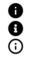
コントロールにアイコンを追加する方法
コントロールの子要素としてアイコンを追加することで表示することができます。
例としてボタンにアイコンを追加します。
<button>
<iconPacks:PackIconModern …/>
</button>
<UserControl
    x:Class="SAMPLE.Sample"
    xmlns="http://schemas.microsoft.com/winfx/2006/xaml/presentation"
    xmlns:x="http://schemas.microsoft.com/winfx/2006/xaml"
    xmlns:d="http://schemas.microsoft.com/expression/blend/2008"
    xmlns:iconPacks="http://metro.mahapps.com/winfx/xaml/iconpacks"
    xmlns:local="clr-namespace:SAMPLE"
    xmlns:mc="http://schemas.openxmlformats.org/markup-compatibility/2006"
    d:DesignHeight="450"
    d:DesignWidth="800"
    mc:Ignorable="d">
    <Grid>
        <Button
            Width="60"
            Height="60"
            HorizontalAlignment="Center"
            VerticalAlignment="Center"
            Style="{DynamicResource MahApps.Styles.Button.Circle}">
            <iconPacks:PackIconModern
                Width="30"
                Height="30"
                Margin="5"
                Kind="Edit" />
        </Button>
    </Grid>
</UserControl>
この書き方でもいいですが、これから紹介するマークアップ機能を使うことでより簡単に記述することができます。
<UserControl
    x:Class="SAMPLE.Sample"
    xmlns="http://schemas.microsoft.com/winfx/2006/xaml/presentation"
    xmlns:x="http://schemas.microsoft.com/winfx/2006/xaml"
    xmlns:d="http://schemas.microsoft.com/expression/blend/2008"
    xmlns:iconPacks="http://metro.mahapps.com/winfx/xaml/iconpacks"
    xmlns:local="clr-namespace:SAMPLE"
    xmlns:mc="http://schemas.openxmlformats.org/markup-compatibility/2006"
    d:DesignHeight="450"
    d:DesignWidth="800"
    mc:Ignorable="d">
    <Grid>
        <Button
            Width="60"
            Height="60"
            HorizontalAlignment="Center"
            VerticalAlignment="Center"
            Content="{iconPacks:Modern Kind=InformationCircle, Height=30, Width=30}"
            Style="{DynamicResource MahApps.Styles.Button.Circle}"/>
    </Grid>
</UserControl>
マークアップ機能のプロパティを組み合わせることでアイコンをコントロールの中で回転させて、プログレスみたいな動作を行うことができます。
<UserControl
    x:Class="SAMPLE.Sample"
    xmlns="http://schemas.microsoft.com/winfx/2006/xaml/presentation"
    xmlns:x="http://schemas.microsoft.com/winfx/2006/xaml"
    xmlns:d="http://schemas.microsoft.com/expression/blend/2008"
    xmlns:iconPacks="http://metro.mahapps.com/winfx/xaml/iconpacks"
    xmlns:local="clr-namespace:SAMPLE"
    xmlns:mc="http://schemas.openxmlformats.org/markup-compatibility/2006"
    d:DesignHeight="450"
    d:DesignWidth="800"
    mc:Ignorable="d">
    <Grid>
        <Button
            Width="60"
            Height="60"
            HorizontalAlignment="Center"
            VerticalAlignment="Center"
            Content="{iconPacks:Unicons Kind=SpinnerAlt,
                                        Height=30,
                                        Width=30,
                                        Spin=True,
                                        SpinDuration=3}"
            Style="{DynamicResource MahApps.Styles.Button.Circle}" />
    </Grid>
</UserControl>

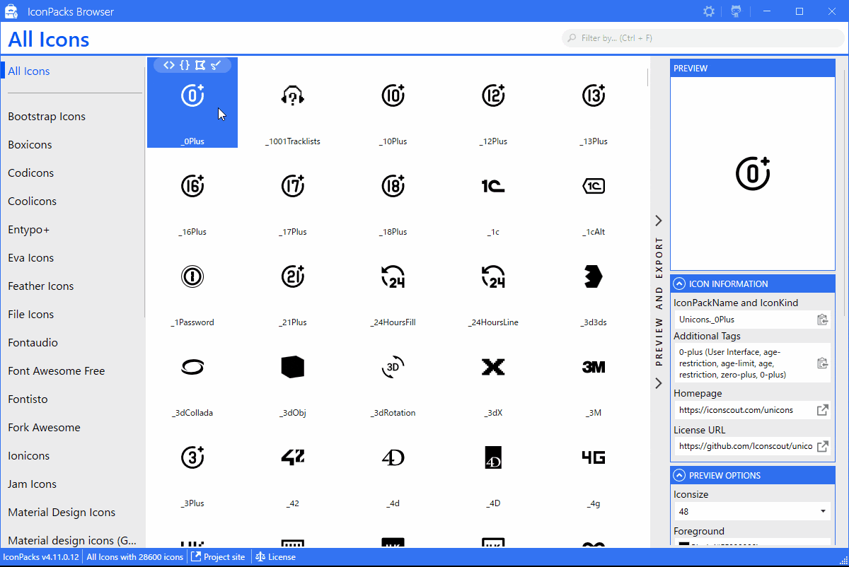
アイコンパックブラウザを活用しよう
MahApps.Metro.IconPacks で利用できるアイコンの種類はかなり豊富です。
PackIconModern で選択できる種類は約2500種類あるので、これだけ種類があるとアイコンを探すだけでも大変です。
そういう場合に使えるツールが「IconPacks Browser」です。
画像付きの一覧で表示してくれるので、探したいアイコンが直ぐに見つかります。また、キーワードで検索して絞り込んむこともできます。
ツールを取得するには、GitHubからダウンロードします。
ダウンロードが完了したら「リビルド」して、「デバッグ」します。
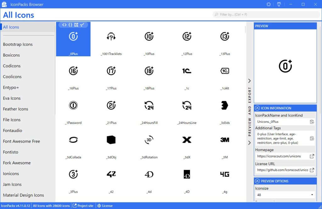
左側に表示されるメニューでは、アイコンのカテゴリを選択することができます。
そのカテゴリのアイコンが画像付きで表示されるので、使いたいアイコンをクリックして XAML コードをコピーしてプロジェクトに貼り付けることが可能です。
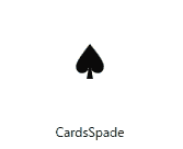
コピーしたXAMLコードは次の通りです。
<iconPacks:PackIconModern Kind="CardsSpade" />
まとめ
MahApps.Metro.IconPacks のアイコンを使ってみて、アイコンの種類が豊富な点に驚きました。無料で利用できる上に簡単な記述でアイコンを表示できるのは助かりますね。
アイコンを画像付きで表示してくれるツールも用意されているので、求めているアイコンを探しやすいのも高評価です。
このアイコンと相性がいいデザインとして MahApps.Metro というライブラリがあります。気になる方は参考にしてみてください。

以上、最後まで読んで頂きありがとうございました。