
WPF でデータのコレクションを UI 画面に表示したいていう場面で活躍するのが「ItemsControl」です。
ItemsControl の基本的な使い方を1つの記事にまとめてみました。見た目を細かく設定するために用意されている4つのプロパティを中心に紹介しています。サンプルコードも載せていますので参考にしてみて下さい。
ItemsControlとは

ItemsControl は様々なデータ形式のオブジェクトのコレクションを並べて表示することができるクラスです。ListBox や ComboBox のように複数のアイテムを持つコントロールの基底クラスでもあります。
<ItemsControl … />
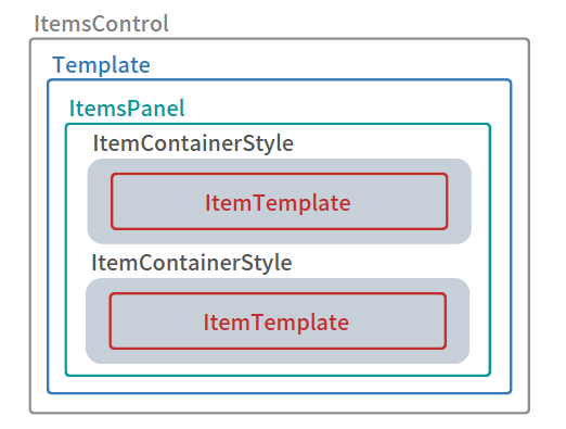
このクラスには次の4つのプロパティがあり、それぞれのプロパティを設定すれば、画面上に表示するレイアウトをカスタマイズすることが可能です。
[jin_icon_checkcircle color=”#e9546b” size=”14px”] Template プロパティ:ItemsPanelを含む外観を定義します。
[jin_icon_checkcircle color=”#e9546b” size=”14px”] ItemsPanel プロパティ:アイテムを並べる Panel を指定します。
[jin_icon_checkcircle color=”#e9546b” size=”14px”] ItemTemplate プロパティ:各アイテムの表示方法を指定します。
[jin_icon_checkcircle color=”#e9546b” size=”14px”] ItemContainerStyle プロパティ:コンテナ要素の動作を設定します。
これらのプロパティの関係を図にすると次のようになっています。
それでは使い方をみていきましょう。
ItemsControlの使い方

WPF は MVVM パターンによる開発が推奨されているので、このパターンを採用したソースコードを紹介したいと思います。
まずは、プロジェクトにフォルダとクラスを追加します。ソリューションエクスプローラーを開いて、プロジェクト名で右クリックして、[追加]を選ぶとフォルダとクラスを追加することができます。
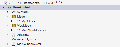
次に MyData クラスに ItemsControl に表示したいデータを追加します。ここでは名前と年齢と住所のデータを1つの MyData クラスに定義します。
namespace ItemsControl.Model
{
    public class MyData
    {
        public string Name { get; set; }
        public int Age { get; set; }
        public string Address { get; set; }
    }
}
ViewModel には ItemsControl に表示したいデータのコレクションを用意します。
データのコレクションは List<T> クラスではなく、ObservableCollection<T> クラスで定義することをオススメします。ObservableCollection クラスを使うことでコレクションのデータを変更した際、ItemsControl へ変更内容が通知されて更新することができます。
using ItemsControl.Model;
using System.Collections.ObjectModel;

namespace ItemsControl.ViewModel
{
    public class MainViewModel
    {
        public ObservableCollection MyDatas { get; private set; }

        public MainViewModel()
        {
            MyDatas = new ObservableCollection
            {
                new MyData(){ Name = "遠藤", Age = 22, Address = "東京" },
                new MyData(){ Name = "田中", Age = 18, Address = "大阪" },
                new MyData(){ Name = "浜口", Age = 25, Address = "愛知" },
                new MyData(){ Name = "松本", Age = 31, Address = "宮崎" },
                new MyData(){ Name = "鈴木", Age = 29, Address = "愛媛" },
            };
        }
    }
}
単純にコレクションを ItemsControl に表示してみます。MainViewModel に定義した MyDatas を ItemsControl の ItemSource にバインディングします。
それと XAML 内で DataContext となる MainViewModel を指定しておきましょう。
<Window
    x:Class="ItemsControl.MainWindow"
    xmlns="http://schemas.microsoft.com/winfx/2006/xaml/presentation"
    xmlns:x="http://schemas.microsoft.com/winfx/2006/xaml"
    xmlns:d="http://schemas.microsoft.com/expression/blend/2008"
    xmlns:local="clr-namespace:ItemsControl"
    xmlns:mc="http://schemas.openxmlformats.org/markup-compatibility/2006"
    xmlns:vm="clr-namespace:ItemsControl.ViewModel"
    Title="MainWindow"
    Width="220"
    Height="140"
    mc:Ignorable="d">
    <Window.DataContext>
        <vm:MainViewModel />
    </Window.DataContext>
    <ItemsControl ItemsSource="{Binding MyDatas}" />
</Window>
ここまで出来たらプログラムを実行してみましょう。
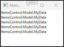
表示された結果は、MyDatas に格納されているオブジェクトの名前になっています。これは ToString メソッドをオーバーライドしていないため、デフォルト値であるオブジェクトの名前を返しているためです。MyData クラスの ToString メソッドをオーバーライドして、名前と年齢と住所のプロパティの情報を伝えるようにします。
namespace ItemsControl.Model
{
public class MyData
{
public string Name { get; set; }
public int Age { get; set; }
public string Address { get; set; }
public override string ToString()
{
return Name + Age + Address;
}
}
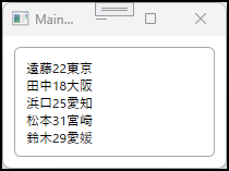
}実行すると次のようになります。
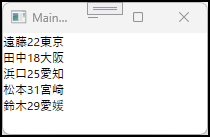
コレクションに追加したアイテムが表示されていますね。ここからは4つのプロパティをそれぞれ設定して外観をカスタマイズしていきます。
Templateプロパティ
Template プロパティには ControlTemplate を指定することで、ItemsControl の全体の見た目を設定できます。
主に Border コントロールで枠線を付けたり、背景色を設定したりします。また、ItemsPresenter でコントロール内に配置するコレクションの位置を決めることができます。
ここでは、丸角で太さが 1px、色がダークグレイの枠線の中に 10px の余白を開けてコレクションを配置しています。
<ItemsControl ItemsSource="{Binding MyDatas}">
    <ItemsControl.Template>
        <ControlTemplate TargetType="ItemsControl">
            <Border
                Margin="10"
                BorderBrush="DarkGray"
                BorderThickness="1"
                CornerRadius="5">
                <ItemsPresenter Margin="10" />
            </Border>
        </ControlTemplate>
    </ItemsControl.Template>
</ItemsControl>
実行すると次のようになります。
ItemsPanelプロパティ
ItemsPanel プロパティには ItemsPanelTemplate を指定することで、コレクションをどうのように並べるかを設定できます。
[jin_icon_checkcircle color=”#e9546b” size=”14px”] StackPanel:アイテムを垂直方向または水平方向に並べます。
[jin_icon_checkcircle color=”#e9546b” size=”14px”] WrapPanel:アイテムを垂直方向または水平方向に並べます。行内で収まらない場合は折り返します。
ItemsPanelTemplate には Panel クラスの派生クラスである StackPanel や WrapPanel を指定できます。他にも Grid を指定することも可能です。デフォルトでは StackPanel が指定されていて、Orientation プロパティは Vertical なのでアイテムを垂直方向に並べます。
アイテムを横並びにする(折り返しなし)
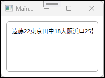
StackPanel を指定して、Orientation プロパティは Horizontal を設定することでアイテムを水平方向に並べます。
<ItemsControl ItemsSource="{Binding MyDatas}">
    <ItemsControl.Template>
        <ControlTemplate TargetType="ItemsControl">
            <Border
                    Margin="10"
                    BorderBrush="DarkGray"
                    BorderThickness="1"
                    CornerRadius="5">
                <ItemsPresenter Margin="10" />
            </Border>
        </ControlTemplate>
    </ItemsControl.Template>
    <ItemsControl.ItemsPanel>
        <ItemsPanelTemplate>
            <StackPanel Orientation="Horizontal"/>
        </ItemsPanelTemplate>
    </ItemsControl.ItemsPanel>
</ItemsControl>
実行すると次のようになります。
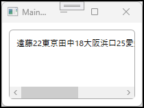
スクロールバーを表示させたい場合は、ControlTemplate に ScrollViewer を追加して、Template プロパティの設定を変更します。
<ItemsControl ItemsSource="{Binding MyDatas}">
    <ItemsControl.Template>
        <ControlTemplate TargetType="ItemsControl">
            <Border
                Margin="10"
                BorderBrush="DarkGray"
                BorderThickness="1"
                CornerRadius="5">
                <ScrollViewer HorizontalScrollBarVisibility="Visible" VerticalScrollBarVisibility="Hidden">
                    <ItemsPresenter Margin="10" />
                </ScrollViewer>
            </Border>
        </ControlTemplate>
    </ItemsControl.Template>
    <ItemsControl.ItemsPanel>
        <ItemsPanelTemplate>
            <StackPanel Orientation="Horizontal" />
        </ItemsPanelTemplate>
    </ItemsControl.ItemsPanel>
</ItemsControl>
実行すると次のようになります。
アイテムを横並びにする(折り返しする)
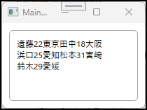
WrapPanel を指定して、Orientation プロパティは Horizontal を設定することでアイテムを水平方向に並べます。このパネルはアイテムが行内に入りきらなくなったら、折り返しながらアイテムを並べるのが特徴です。
<ItemsControl ItemsSource="{Binding MyDatas}">
    <ItemsControl.Template>
        <ControlTemplate TargetType="ItemsControl">
            <Border
                Margin="10"
                BorderBrush="DarkGray"
                BorderThickness="1"
                CornerRadius="5">
                <ItemsPresenter Margin="10" />
            </Border>
        </ControlTemplate>
    </ItemsControl.Template>
    <ItemsControl.ItemsPanel>
        <ItemsPanelTemplate>
            <WrapPanel Orientation="Horizontal" />
        </ItemsPanelTemplate>
    </ItemsControl.ItemsPanel>
    <ItemsControl.ItemTemplate>
        <DataTemplate>
            <StackPanel Orientation="Horizontal">
                <TextBlock Text="{Binding Name}" />
                <TextBlock Text="{Binding Age}" />
                <TextBlock Text="{Binding Address}" />
            </StackPanel>
        </DataTemplate>
    </ItemsControl.ItemTemplate>
</ItemsControl>
実行すると次のようになります。
ItemTemplateプロパティ
ItemsTemplate プロパティには DataTemplate を指定することで、コレクションのアイテムをどうのように表示するかを設定できます。
DataTemplate 内に配置した TextBlock に、MyData クラスの各プロパティをバインドして画面に表示します。
<ItemsControl ItemsSource="{Binding MyDatas}">
<ItemsControl.Template>
<ControlTemplate TargetType="ItemsControl">
<Border
Margin="10"
BorderBrush="DarkGray"
BorderThickness="1"
CornerRadius="5">
<ItemsPresenter Margin="10" />
</Border>
</ControlTemplate>
</ItemsControl.Template>
<ItemsControl.ItemsPanel>
<ItemsPanelTemplate>
<WrapPanel Orientation="Horizontal" />
</ItemsPanelTemplate>
</ItemsControl.ItemsPanel>
<ItemsControl.ItemTemplate>
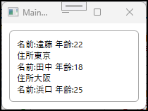
<DataTemplate>
<StackPanel Orientation="Vertical">
<TextBlock>
<TextBlock.Text>
<MultiBinding StringFormat="名前:{0} 年齢:{1}">
<Binding Path="Name" />
<Binding Path="Age" />
</MultiBinding>
</TextBlock.Text>
</TextBlock>
<TextBlock Text="{Binding Address, StringFormat=住所{0}}"/>
</StackPanel>
</DataTemplate>
</ItemsControl.ItemTemplate>
</ItemsControl>実行すると次のようになります。
ItemContainerStyleプロパティ
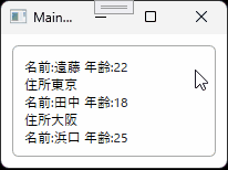
ItemsContainerStyle プロパティには Style を指定することで、コレクションの各コンテナ要素をカスタマイズする設定ができます。例えば、マウスカーソルが ItemsControl のアイテム上に移動した時に色を変えたり、アイテムが選択された時に色を変える等の動的な変更を実現することが可能になります。
ここではマウスカーソルが ItemsControl のアイテムに移動した時に文字の色を赤色へ変えるようにします。
<ItemsControl ItemsSource="{Binding MyDatas}">
    <ItemsControl.Template>
        <ControlTemplate TargetType="ItemsControl">
            <Border
                    Margin="10"
                    BorderBrush="DarkGray"
                    BorderThickness="1"
                    CornerRadius="5">
                <ItemsPresenter Margin="10" />
            </Border>
        </ControlTemplate>
    </ItemsControl.Template>
    <ItemsControl.ItemsPanel>
        <ItemsPanelTemplate>
            <WrapPanel Orientation="Horizontal" />
        </ItemsPanelTemplate>
    </ItemsControl.ItemsPanel>
    <ItemsControl.ItemTemplate>
        <DataTemplate>
            <StackPanel Orientation="Vertical">
                <TextBlock x:Name="textblock">
                    <TextBlock.Text>
                        <MultiBinding StringFormat="名前:{0} 年齢:{1}">
                            <Binding Path="Name" />
                            <Binding Path="Age" />
                        </MultiBinding>
                    </TextBlock.Text>
                </TextBlock>
                <TextBlock Text="{Binding Address, StringFormat=住所{0}}" />
            </StackPanel>
        </DataTemplate>
    </ItemsControl.ItemTemplate>
    <ItemsControl.ItemContainerStyle>
        <Style>
            <Style.Triggers>
                <Trigger Property="Control.IsMouseOver" Value="True">
                    <Setter Property="Control.Foreground" Value="Red" />
                </Trigger>
            </Style.Triggers>
        </Style>
    </ItemsControl.ItemContainerStyle>
</ItemsControl>
実行すると次のようになります。
ItemsControlにUserControlを表示

UI コントロールの組み合わせを何度も表示したい場合は、その UI コントロールの組み合わせをUserControlにして表示する場合があります。この時、ItemsControlを使うことで UserControl を並べて表示することができます。
次の記事でサンプルを紹介していますので興味がある方は確認してみて下さい。

まとめ
この記事では、ItemsControl の使い方をまとめて紹介しました。ItemsControl は4つのプロパティを使うことで外観を自由にカスタマイズする事が可能です。
[jin_icon_checkcircle color=”#e9546b” size=”14px”] Template プロパティ:ItemsPanelを含む外観を定義します。
[jin_icon_checkcircle color=”#e9546b” size=”14px”] ItemsPanel プロパティ:アイテムを並べる Panel を指定します。
[jin_icon_checkcircle color=”#e9546b” size=”14px”] ItemTemplate プロパティ:各アイテムの表示方法を指定します。
[jin_icon_checkcircle color=”#e9546b” size=”14px”] ItemContainerStyle プロパティ:コンテナ要素の動作を設定します。
ItemsControl は使用用途が幅広く、コレクションを表示する場面では活躍するコントロールなので、是非使いこなせるようになりましょう。
以上、最後まで読んで頂きありがとうございました。