

Picker でどうやって使うの!?
この記事では、.NET MAUI で使う Picker コントロールの使い方についてまとめています。
Picker は複数の項目から1つの項目をユーザーが選択するためのコントロールで、使用頻度が高いコントロールです。
ぜひこの記事を参考にしてみて下さい。

オススメの参考書
丁寧に解説された1冊。リリースされて間もない.NET MAUI の基礎が学べるので、これから Android や iOS などをターゲットとして開発するなら非常に参考になる書籍です。

Pickerとは

.NET MAUI の Picker(ピッカー)は、ユーザーが複数の項目の一覧から1つの項目を選択するためのコントロールです。
<Picker …/>
WPF や WinForms は ComboBox コントロールを使うのがお馴染みですが、Xamarin や MAUI では Picker コントロールを使います。
この Picker は、Android と iOS では動作が異なるという特徴があります。
Android の場合は Picker コントロールの上にダイアログのように表示されます。一方で、iOS の場合は画面の下部に複数の項目のリストが表示されます。それぞれの OS に合わせた形で表示されますが、ソースコードは OS によって変える必要はありません。
Pickerの使い方

Picker コントロールに項目をセットするには、ItemsSource プロパティにコレクションをセットします。
x:Array マークアップ拡張機能を介して、XAML 内にオブジェクトの配列を作成して、ItemsSource プロパティに設定します。
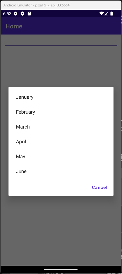
<Picker Margin="10,0,10,0">
    <Picker.ItemsSource>
        <x:Array Type="{x:Type x:String}">
            <x:String>January</x:String>
            <x:String>February</x:String>
            <x:String>March</x:String>
            <x:String>April</x:String>
            <x:String>May</x:String>
            <x:String>June</x:String>
        </x:Array>
    </Picker.ItemsSource>
</Picker>
Android エミュレーターで実行すると、次のような結果になります。
項目を選択すると、次のように選択した項目が Picker 上に表示されます。

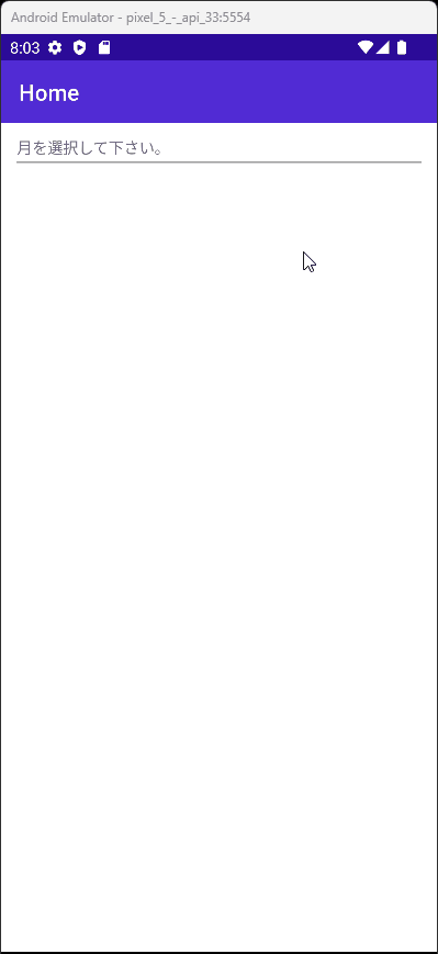
タイトルを表示する
アイテムが選択されていない時にタイトルを表示するには、Title プロパティを使います。
このプロパティで指定した文字列が薄いグレーで表示されます。
<Picker Title="月を選択して下さい。"
        Margin="10,0,10,0">
    <Picker.ItemsSource>
        <x:Array Type="{x:Type x:String}">
            <x:String>January</x:String>
            <x:String>February</x:String>
            <x:String>March</x:String>
            <x:String>April</x:String>
            <x:String>May</x:String>
            <x:String>June</x:String>
        </x:Array>
    </Picker.ItemsSource>
</Picker>
Android エミュレーターで実行すると、次のような結果になります。

タイトルの文字列の色を変更したい場合は、TitleColor プロパティを使います。色を青に指定すると次のような結果になります。

選択した項目を取得する
ユーザーが選択した項目を取得するには、SelectedItem プロパティを使います。何も選択されていない場合は null になります。
次の例では、Picker で選択した項目を Label に表示します。
<VerticalStackLayout Margin="10,0,10,0">
    <Picker x:Name="MyPicker" Title="月を選択して下さい。">
        <Picker.ItemsSource>
            <x:Array Type="{x:Type x:String}">
                <x:String>January</x:String>
                <x:String>February</x:String>
                <x:String>March</x:String>
                <x:String>April</x:String>
                <x:String>May</x:String>
                <x:String>June</x:String>
            </x:Array>
        </Picker.ItemsSource>
    </Picker>
    <Label Text="{Binding Source={x:Reference MyPicker}, Path=SelectedItem}" Margin="5" />
</VerticalStackLayout>
Android エミュレーターで実行すると、次のような結果になります。
データバインディングを使用する
Picker の ItemsSource プロパティにコレクションをバインディングして選択できる項目を設定します。
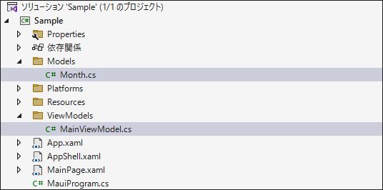
まずは ViewModels フォルダを作成し、そのフォルダの中に MainViewModel クラスを作成します。同様に、Models フォルダを作成し、そのフォルダの中に Month クラスを作成します。
先ほど作成した Month.cs に次のプロパティを定義します。
public class Month
{
    public string Name { get; set; }
    public string EnglishNotation { get; set; }
}
続いて MainViewModel.cs を開いて、ObservableCollection<Month> で Months プロパティを定義します。
MainViewModel のコンストラクタで Months の初期設定を行います。
class MainViewModel
{
    public ObservableCollection<Month> Months { get; }
    public MainViewModel()
    {
        Months = new ObservableCollection<Month>
        {
            new Month { Name = "1月", EnglishNotation = "January" },
            new Month { Name = "2月", EnglishNotation = "February" },
            new Month { Name = "3月", EnglishNotation = "March" },
            new Month { Name = "4月", EnglishNotation = "April" },
            new Month { Name = "5月", EnglishNotation = "May" },
            new Month { Name = "6月", EnglishNotation = "June" }
        };
    }
}
MainPage.xaml を開いて Picker のItemsSource に MainViewModel に定義した Months をバインディングします。
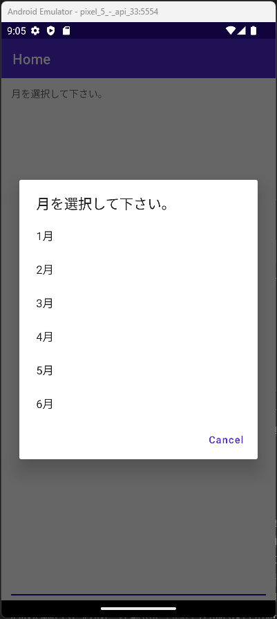
Picker の ItemDisplayBinding プロパティに Month クラスの Name プロパティをバインディングします。こうすることで選択項目に Name プロパティにセットされた値が表示されます。
それと BindingContext に MainViewModel.cs を設定しておきます。
<ContentPage
    x:Class="Sample.MainPage"
    xmlns="http://schemas.microsoft.com/dotnet/2021/maui"
    xmlns:x="http://schemas.microsoft.com/winfx/2009/xaml"
    xmlns:viewModel="clr-namespace:Sample.ViewModels">
    <ContentPage.BindingContext>
        <viewModel:MainViewModel />
    </ContentPage.BindingContext>
    <Picker
        Title="月を選択して下さい。"
        Margin="10,0,10,0"
        ItemDisplayBinding="{Binding Name}"
        ItemsSource="{Binding Months}" />
</ContentPage>
Android エミュレーターで実行すると、次のような結果になります。
イベントをコマンドで実行する
Picker には Command プロパティは用意されていません。そのため、Behavior を介して Command を実行します。この時に比較的お手軽に Behavior を扱えるが CommunityToolkit.Maui の EventToCommandBehavior というツールです。

このツールを使って、ユーザーが項目を選択した時に発生する SelectedIndexChanged イベントを使用した例を紹介します。
MainViewModel で Command の定義と実行メソッドの処理を記述します。
class MainViewModel
{
    public ObservableCollection<Month> Months { get; }
    public ICommand SelectedIndexChangedCommand { get; set; }
    public MainViewModel()
    {
        Months = new ObservableCollection<Month>
        {
            new Month { Name = "1月", EnglishNotation = "January" },
            new Month { Name = "2月", EnglishNotation = "February" },
            new Month { Name = "3月", EnglishNotation = "March" },
            new Month { Name = "4月", EnglishNotation = "April" },
            new Month { Name = "5月", EnglishNotation = "May" },
            new Month { Name = "6月", EnglishNotation = "June" }
        };

        SelectedIndexChangedCommand = new Command(x => OnSelectedIndexChangedCommand(x));
    }

    private void OnSelectedIndexChangedCommand(object obj)
    {
        var month = obj as Month;
        Debug.WriteLine($"月:{month.Name} 英語表記:{month.EnglishNotation}");
    }
}
MainPage.xaml を次のように記述します。
<?xml version="1.0" encoding="utf-8" ?>
<ContentPage
    x:Class="Sample.MainPage"
    xmlns="http://schemas.microsoft.com/dotnet/2021/maui"
    xmlns:x="http://schemas.microsoft.com/winfx/2009/xaml"
    xmlns:toolkit="http://schemas.microsoft.com/dotnet/2022/maui/toolkit"
    xmlns:viewModel="clr-namespace:Sample.ViewModels">
    <ContentPage.BindingContext>
        <viewModel:MainViewModel />
    </ContentPage.BindingContext>
    <Picker
        x:Name="MyPicker"
        Title="月を選択して下さい。"
        Margin="10,0,10,0"
        ItemDisplayBinding="{Binding Name}"
        ItemsSource="{Binding Months}">
        <Picker.Behaviors>
            <toolkit:EventToCommandBehavior
                Command="{Binding SelectedIndexChangedCommand}"
                CommandParameter="{Binding Source={x:Reference MyPicker}, Path=SelectedItem}"
                EventName="SelectedIndexChanged" />
        </Picker.Behaviors>
    </Picker>
</ContentPage>
Android エミュレーターで実行して、Picker の選択項目から項目を1つ選択すると、次のようなデバッグログが出力されます。
月:1月 英語表記:January
まとめ

この記事では、.NET MAUI で使う Picker コントロールの使い方についてまとめました。
.NET MAUIでのアプリ開発の参考になれば幸いです。
以上、最後まで読んで頂きありがとうございました。