Button はユーザーにタップもしくはクリックしてもらうことで、何らかのアクションを行うトリガーとして使用されます。
アプリには必ずと言っていいほど使われており、なくてはならない UI コントロールの1つとも言えます。

.NET MAUでButtonを使う方法を知りたい。
この記事では、.NET MAUI の UI コントロールの1つである Button の使い方をサンプルコードと画像を用いて分かりやすく解説します。
Button のプロパティやイベント、コマンドのことを知りたい方は、ぜひ参考にしてみて下さい。
オススメの参考書
丁寧に解説された1冊。リリースされて間もない.NET MAUI の基礎が学べるので、これから Android や iOS などをターゲットとして開発するなら非常に参考になる書籍です。

Button(ボタン)とは

Button とはテキストを表示し、タップまたはクリックをトリガーとして処理を実行する UI コントロールの1つです。
<Button …/>
処理を実行するには、Clicked イベントもしくは Command プロパティを使います。MVVM パターンでアプリ開発する際は、Command プロパティを使うことになります。
また、テキスト以外にも画像データを Button 上に表示することができます。テキストと画像を組み合わせることも可能です。
Buttonの使い方

ここからは .NET MAUI で Button を使う方法について紹介します。
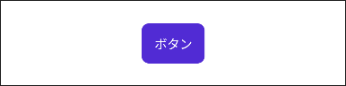
XAML ファイルを開いて、次のようにコードを記述すると Button を表示することができます。
<StackLayout>
    <Button Text="ボタン" HorizontalOptions="Center" VerticalOptions="Center"/>
</StackLayout>
Android エミュレーターで実行すると、次のような結果になります。
アプリの画面に Button を表示することができました。
境界線を設定する
Buttonの境界線を設定するには、BorderColor や BorderWidth、CornerRadius などのプロパティを使います。
- BorderColor プロパティ:境界線の色を設定または取得する
- BorderWidth プロパティ:境界線の幅を設定または取得する
- CornerRadius プロパティ:角の半径を設定または取得する
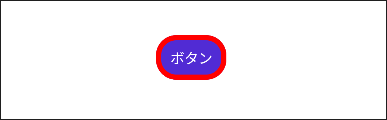
次の例は境界線の色を赤、幅を5、角の半径を20にしたサンプルです。
<StackLayout>
    <Button
        BorderColor="Red"
        BorderWidth="5"
        CornerRadius="20"
        HorizontalOptions="Center"
        Text="ボタン"
        VerticalOptions="Center" />
</StackLayout>
Android エミュレーターで実行すると、次のような結果になります。
テキストのスタイルを設定する
Button のテキストのスタイルを設定するには、FontAttributes や FontSize、TextColor などのプロパティを使います。
- FontAttributes プロパティ:文字を強調する太字・斜体を設定または取得する
- FontSize プロパティ:フォントのサイズを設定または取得する
- TextColor プロパティ:テキストの色を設定または取得する
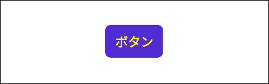
次の例は境界線の色を赤、幅を5、角の半径を20にしたサンプルです。
<StackLayout>
    <Button
        FontAttributes="Bold"
        FontSize="Medium"
        HorizontalOptions="Center"
        Text="ボタン"
        TextColor="Yellow"
        VerticalOptions="Center" />
</StackLayout>
Android エミュレーターで実行すると、次のような結果になります。
画像を設定する
Button に画像を設定するには、ImageSource プロパティを使います。
- ImageSource プロパティ:画像データを設定または取得する
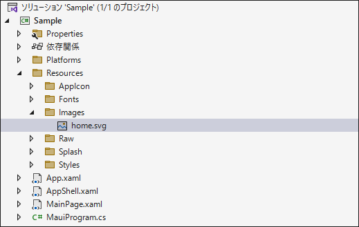
ImageSource に設定する画像データを準備します。ここでは、home.svg という画像データを用意しました。

プロジェクトのソリューションエクスプローラーを開いて、Resources フォルダの Images フォルダに home.svg を追加します。
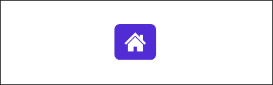
次の例は ImageSource プロパティに home.svg を設定したサンプルです。
<StackLayout>
    <Button
        HorizontalOptions="Center"
        ImageSource="home.svg"
        VerticalOptions="Center" />
</StackLayout>
Android エミュレーターで実行すると、次のような結果になります。
イベントを設定する
Button には、Button が押された時に発生する Pressed イベントや 指またはマウスポインタが離れた時に発生する Released イベント等があります。
ここではタップまたはクリックした後に発生する Clicked イベントを設定します。XAML に Clicked イベントのイベントハンドラを登録します。
<StackLayout>
    <Button
        Clicked="Button_Clicked"
        HorizontalOptions="Center"
        Text="ボタン"
        VerticalOptions="Center" />
</StackLayout>
先ほど XAML に登録したイベントハンドラはコードビハインドに記述します。
第1引数の sender はイベントを実行したオブジェクトが渡されるので、CheckBox でキャストすると プロパティにアクセスできます。第2引数の e にはチェック状態が渡されます。
次の例では、イベントを発生させた Button の背景色を変更するサンプルです。
private void Button_Clicked(object sender, EventArgs e)
{
    var button = sender as Button;
    button.BackgroundColor = Color.FromRgba("28C2D1");
}
Android エミュレーターで実行すると、次のような結果になります。

コマンドを設定する
MVVM パターンでアプリ開発する際は、View と View 以外を分離するために Command を使用します。
Command は Clicked イベントの代わりとして利用することができます。
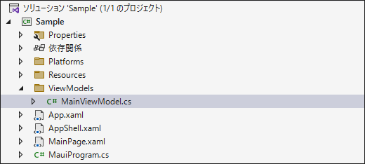
Command を実装する前にプロジェクトに、ViewModels というフォルダを作成し、そのフォルダ内に MainViewModel.cs を作成します。
続いて、MainViewModel.cs を開いて、ICommand 型で ClickedCommand プロパティを定義します。クラスのコンストラクタでは、コマンドのインスタンスを生成し、コマンドの実行処理部分を実装します。
using System.Windows.Input;

namespace Sample.ViewModels
{
    public class MainViewModel
    {
        // ボタンのコマンド
        public ICommand ClickedCommand { get; set; }

        // コンストラクタ
        public MainViewModel()
        {
            // コマンドのインスタンス化
            ClickedCommand = new Command(obj =>
            {
                // コマンドの実行処理
                var button = (Button)obj;
                button.Background = Color.FromRgba("28C2D1");
            });
        }
    }
}
MainPage.xaml を開きます。Button に Command プロパティを追加して、ClickedCommand をバインディングします。CommandParameter プロパティには Button のオブジェクトを設定します。(12 ~ 13行目)
View と ViewModel を紐づけるために BindingContext に MainViewModel を設定します。(6 ~ 8行目)
<ContentPage
    x:Class="Sample.MainPage"
    xmlns="http://schemas.microsoft.com/dotnet/2021/maui"
    xmlns:x="http://schemas.microsoft.com/winfx/2009/xaml"
    xmlns:vm="clr-namespace:Sample.ViewModels" >
    <ContentPage.BindingContext>
        <vm:MainViewModel />
    </ContentPage.BindingContext>
    <StackLayout>
        <Button
            x:Name="MyButton"
            Command="{Binding ClickedCommand}"
            CommandParameter="{Binding Source={x:Reference MyButton}}"
            HorizontalOptions="Center"
            Text="ボタン"
            VerticalOptions="Center" />
    </StackLayout>
</ContentPage>
Android エミュレーターで実行すると、次のような結果になります。
アニメーションをカスタマイズする
Microsoft が提供している CommunityToolkit.Maui ライブラリと ViewExtensions クラスのメソッドを組み合わせることで、次のように Button のアニメーションをカスタマイズできます。

Button のアニメーションをカスタマイズしたい方は、次の記事を参照してください。

まとめ

この記事では .NET MAUI の Button を使う方法を紹介しました。
Button はテキストを表示し、タップまたはクリックをトリガーとして処理を実行する UI コントロールです。
Clicked イベントを使って、タップまたはクリックの処理を記述することができます。また、Command プロパティを利用することで MVVM パターンに従ったアプリ開発が可能になります。
この記事が Button を使用する際の参考になれば幸いです。
以上、最後まで読んで頂きありがとうございました。